I joined Capital Group as a member of the UX team that was tasked with improving the user experience of internal applications. Our focus was part of an ongoing effort to migrate from their legacy Application of Record to a new platform. The AOR is over 20 years old, lacking in functionality, as well as the ability to update the code base. However, this provided me a unique opportunity as a designer. The legacy system was poorly built and lacking in best practices for UI/UX, but the users were entrenched in the metal models and muscle memory of the broken system that facilitated their daily work flow.


Images from a team white boarding session (above).
Resulting explorations using time as a metric. We explored taking the individual fields that failed during a post-scan digitization process and sending singular failed fields to multiple associates instead of sending the entire form for review to a single associate (below).
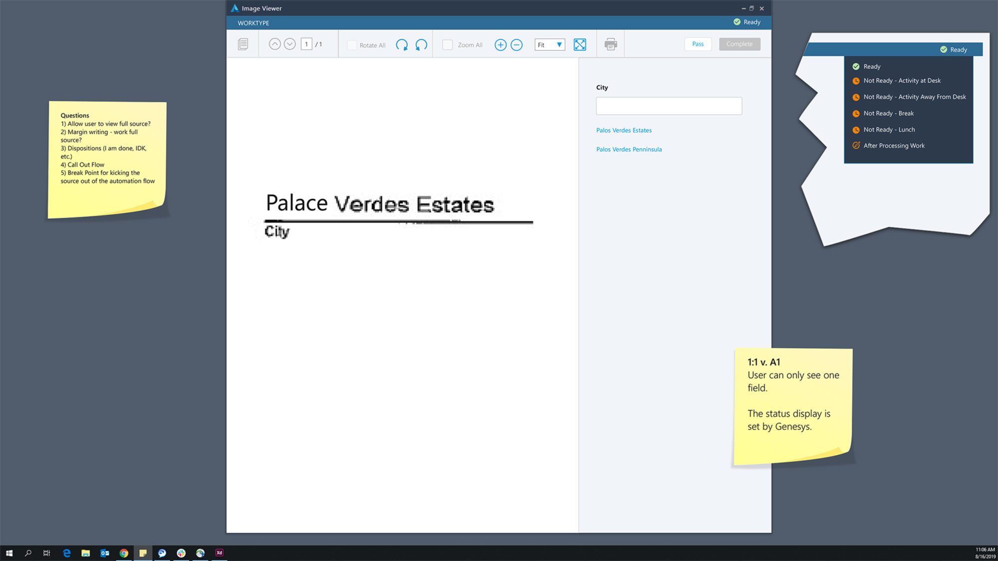
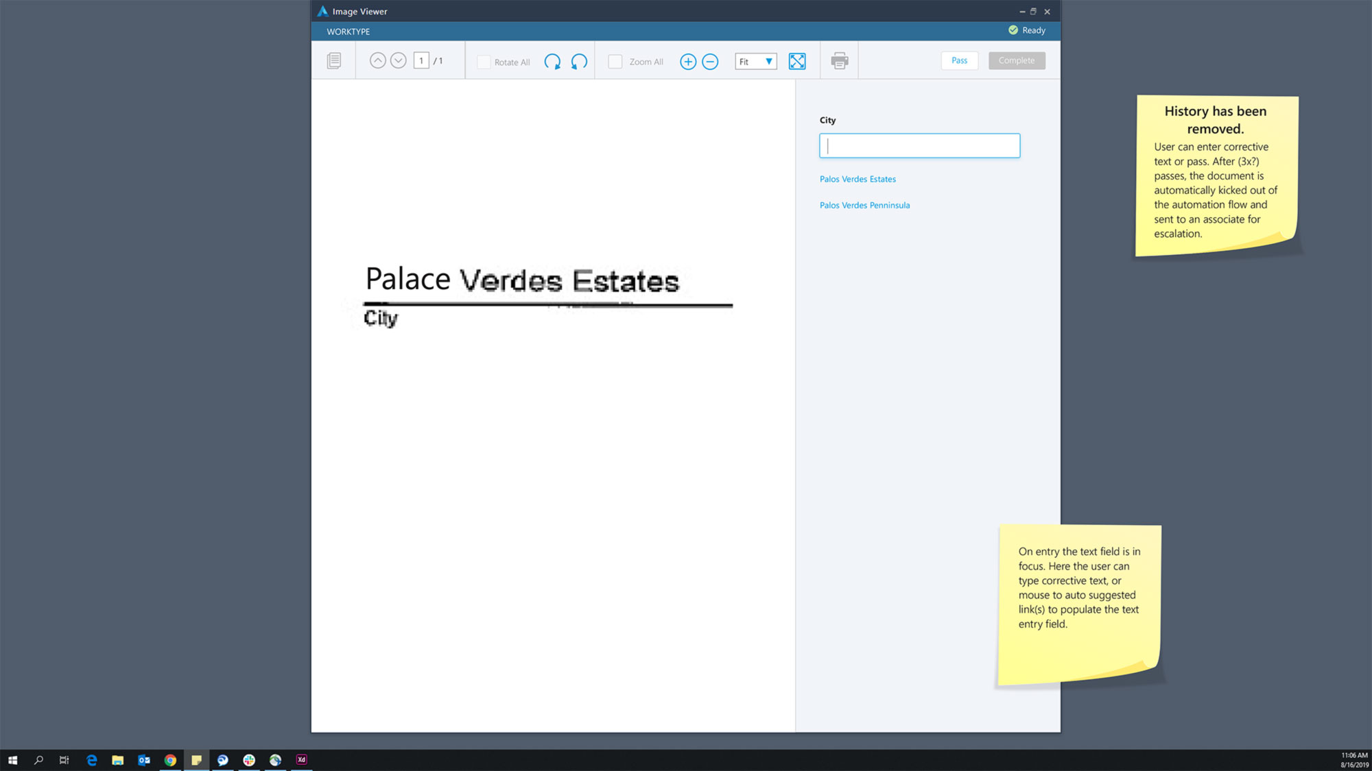
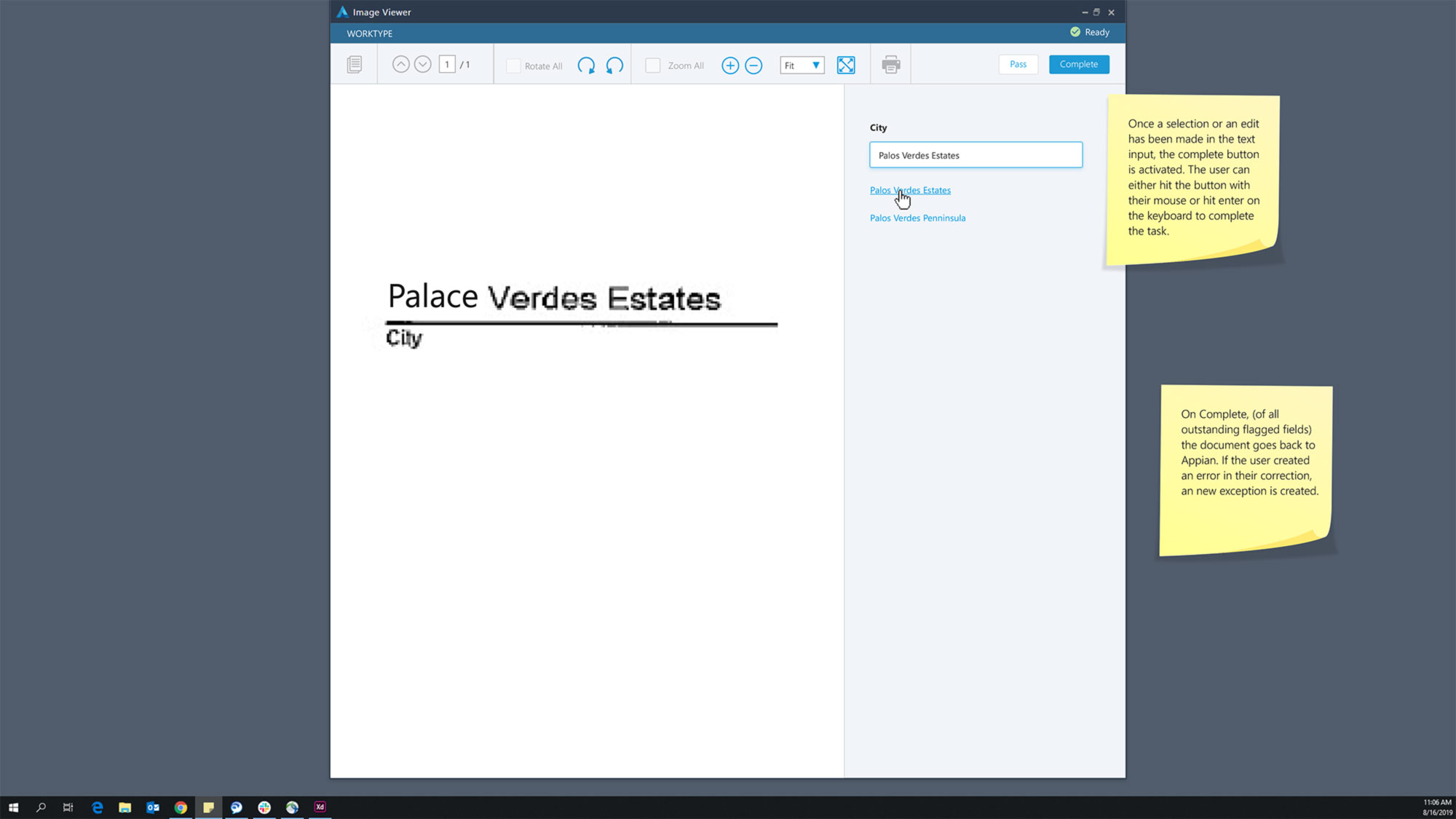
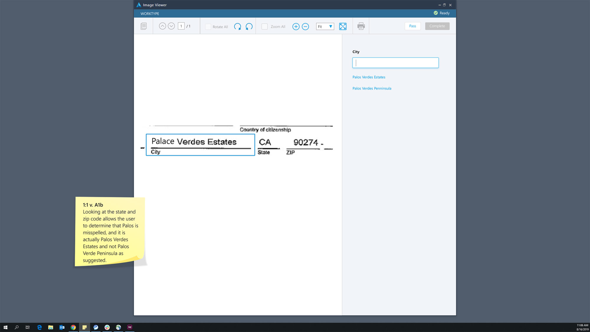
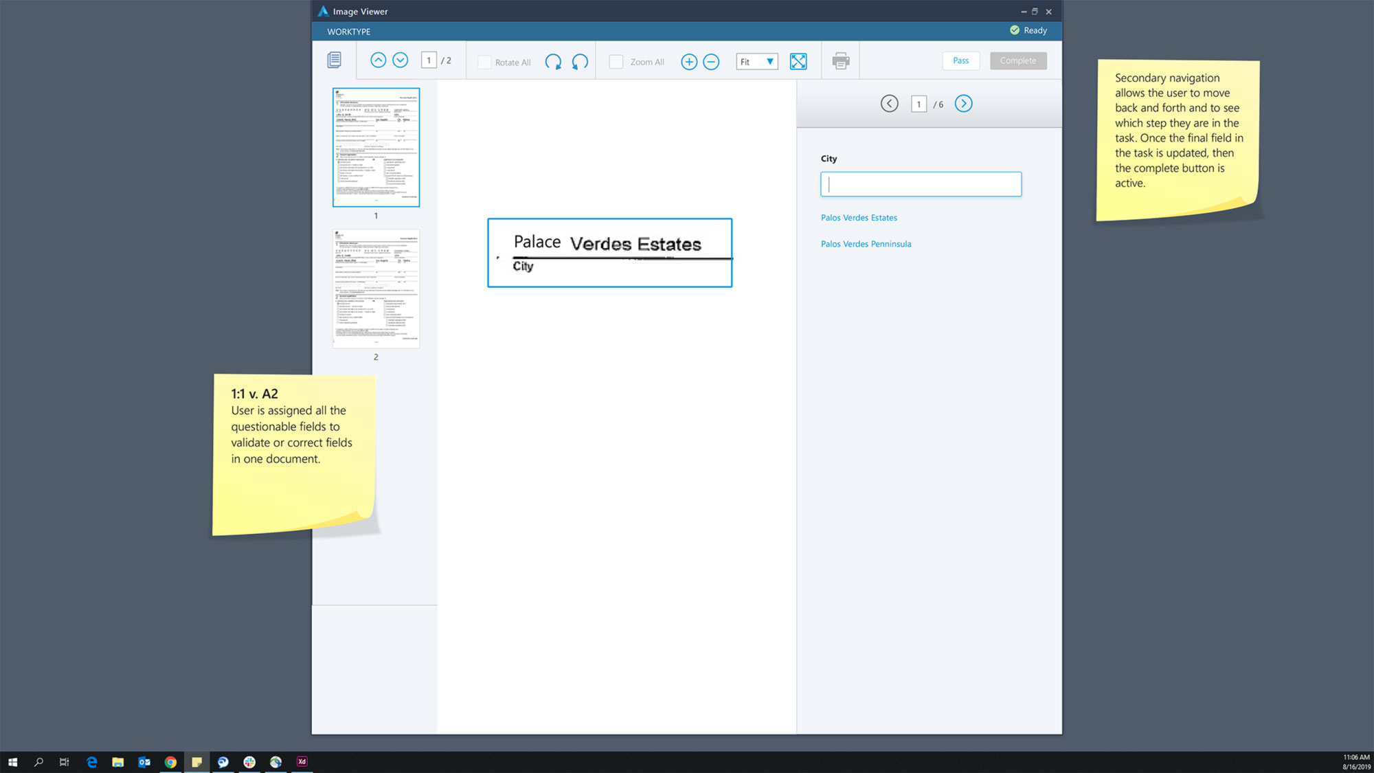
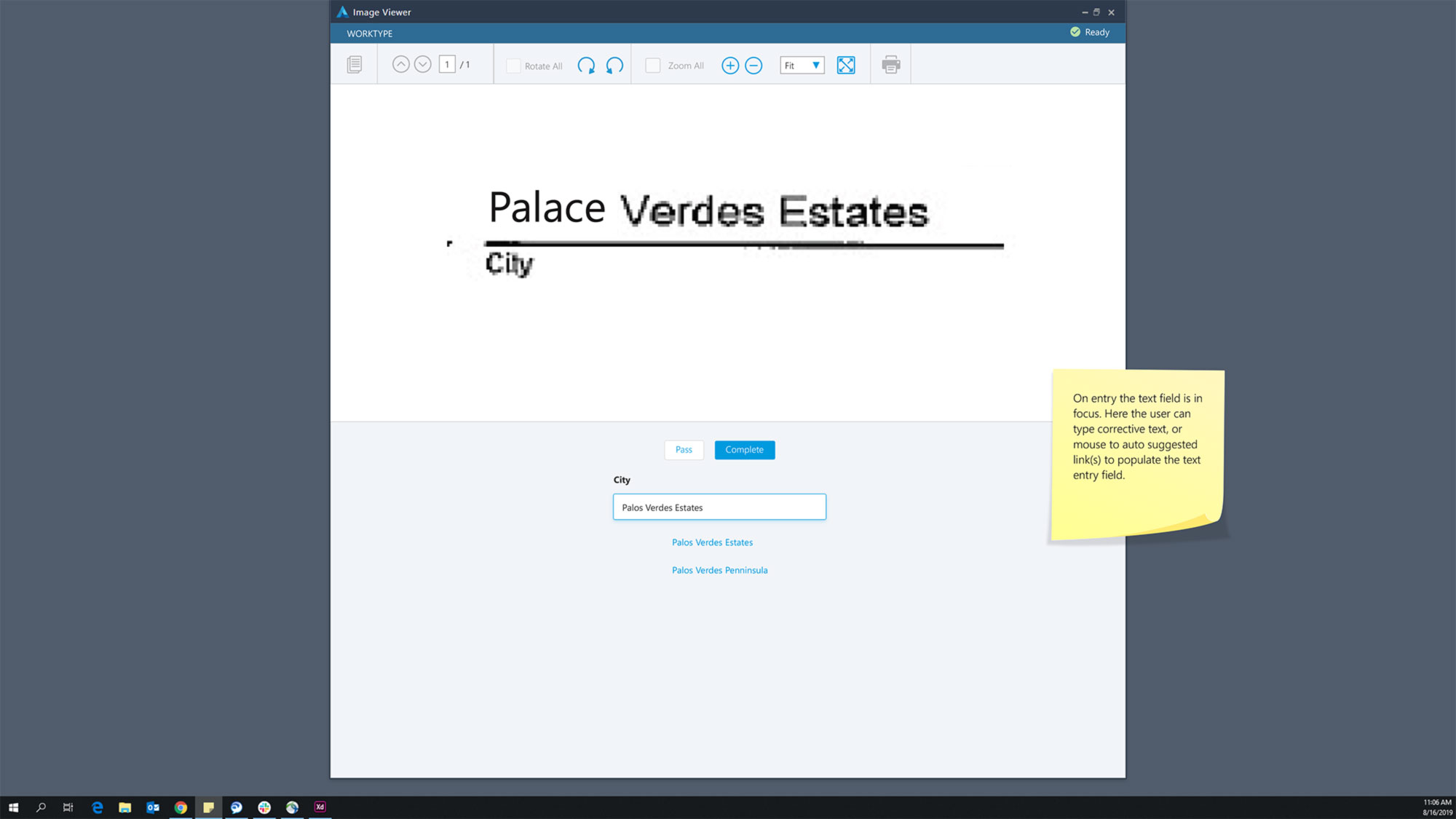
There were two primary use cases to solve for – user interactions via telephone and interactions with documents. Capital started with improving the UX and building functionality for telephone before moving on to documents in early 2019, when I came on board. Current state documentation processing did not allow for any digitization — all forms were printed, mailed in, scanned, then reviewed by a user to manually enter all information contained on the form into a series of applications and databases. Moving from a manual process to more of an automated process was an opportunity for the business to gain not only a better interface, but a reduction in errors, reduce the time to complete tasks, and the ability to utilize a team of lower skilled processors to remediate common errors.
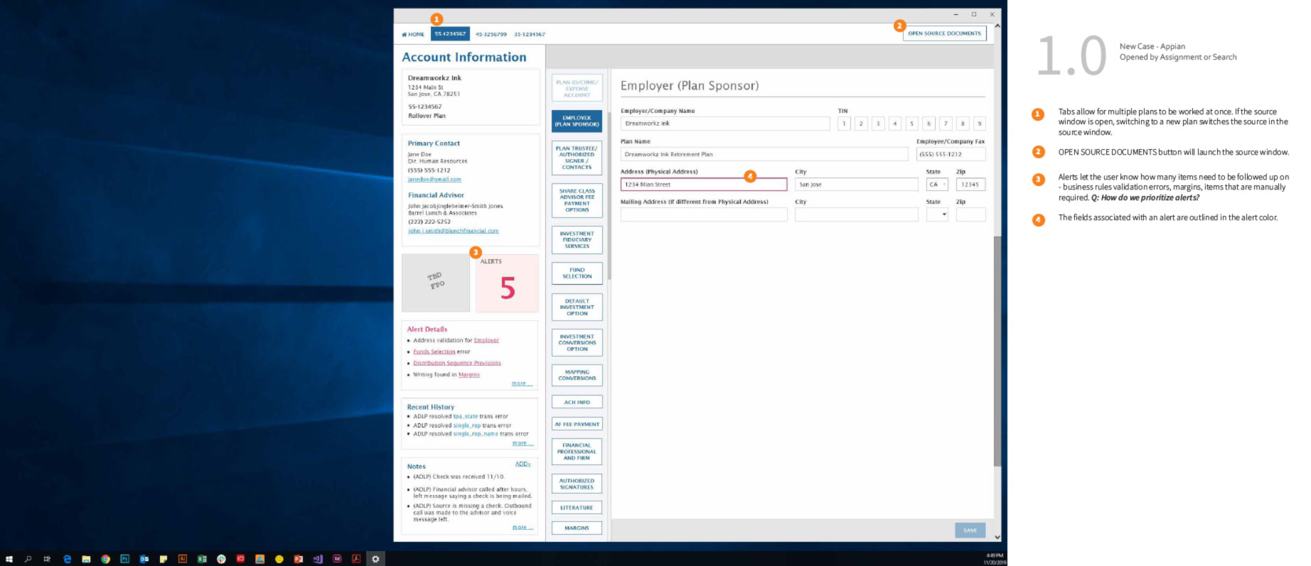
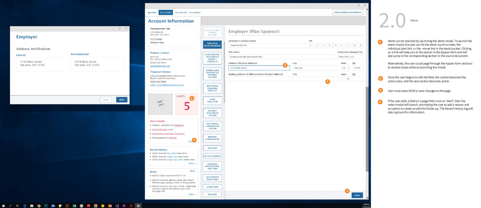
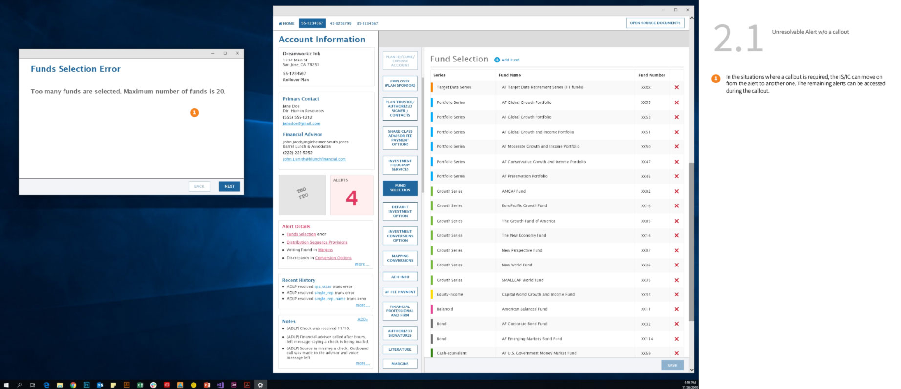
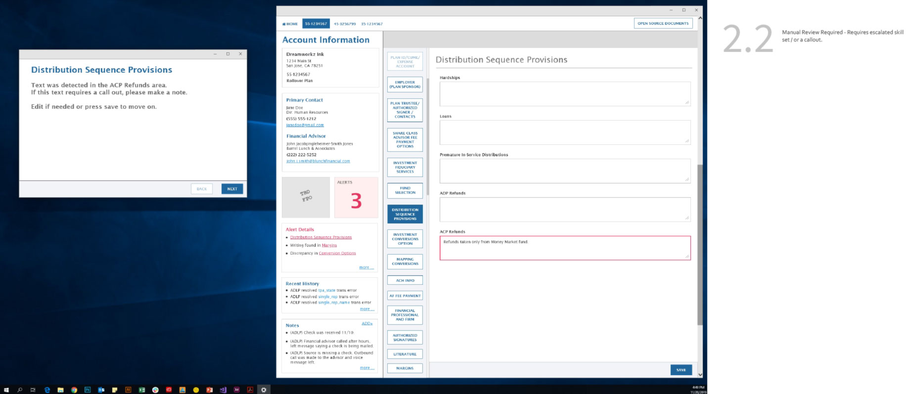
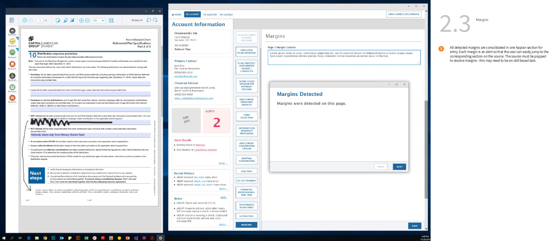
Wireframes for redesign of Retirement Plans with mailed-in forms on an Appian platform (above). These wireframes solve for exceptions that arise after the form has been digitized and the data has been entered, however, a discrepancy remains and an associate must make a phone call to the client to resolve.
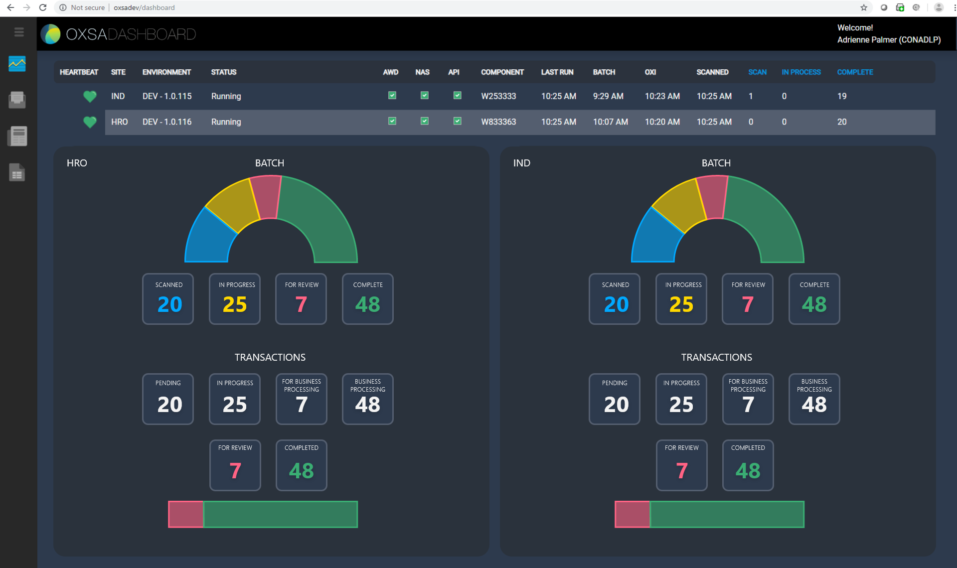
Designed a dashboard for the mail scanning operations team (below). Dashboard design allows for observability as incoming mail is scanned and processed. Used both as a desktop application and projected on a large screen in the mailrooms, managers and associates can view progress and issues in real time. I also designed a custom logo to add a little polish to the user interface.
One benefit of designing for internal users is the ability to gain feedback easily. I spent time sitting with users as they took calls, meeting with users to find what pain points they were experiencing with their current application stack, and how changes were received in early adopter test environments.
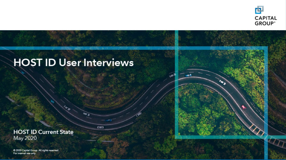
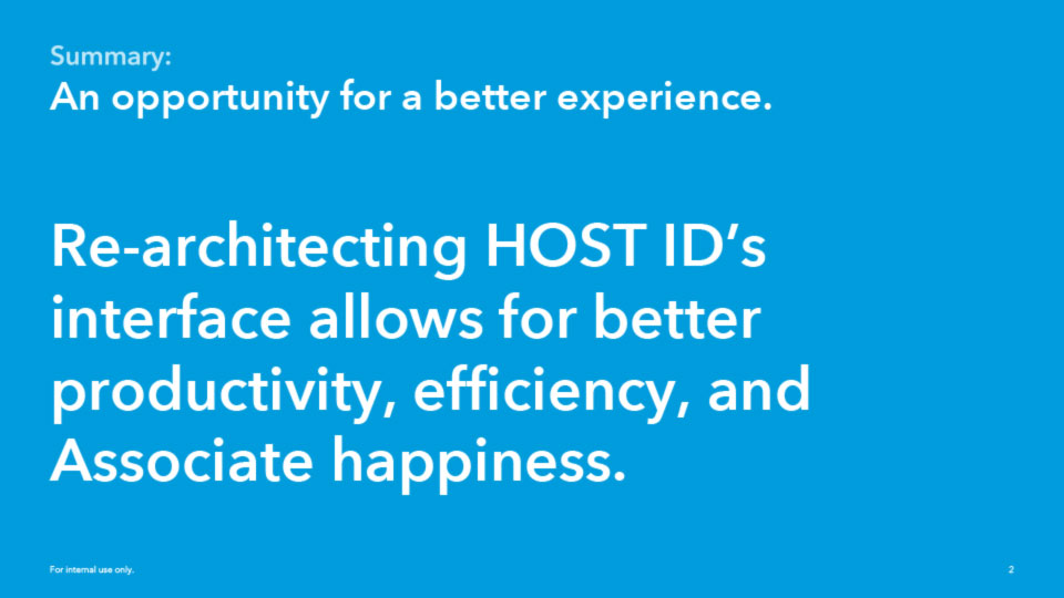
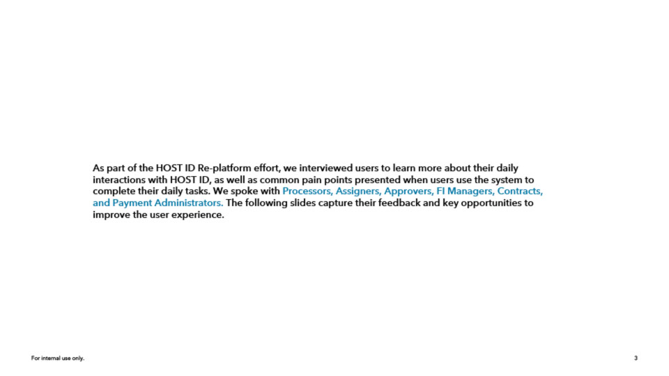
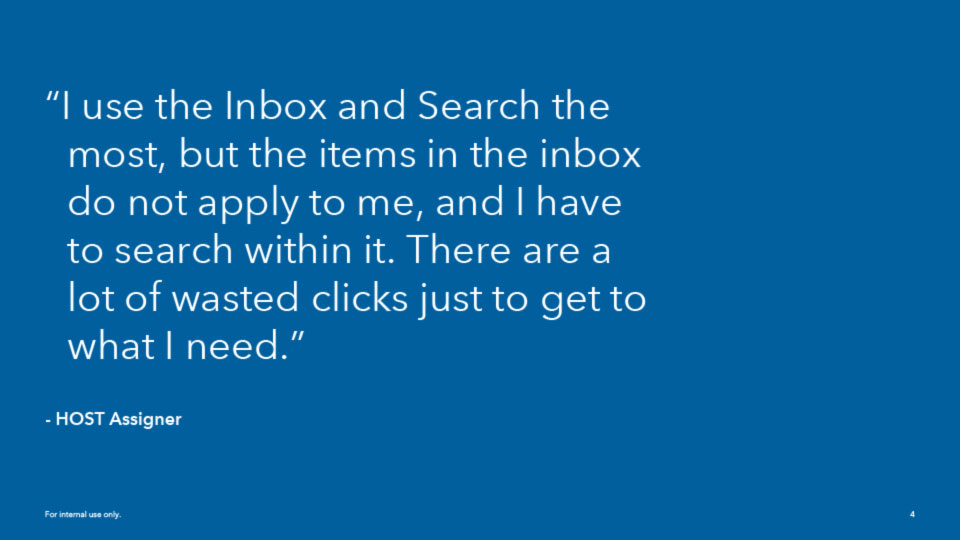
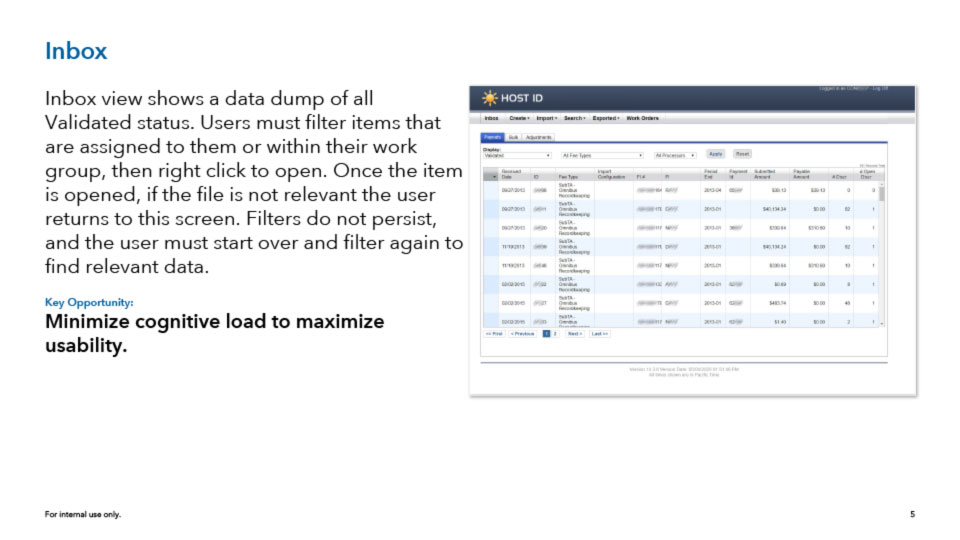
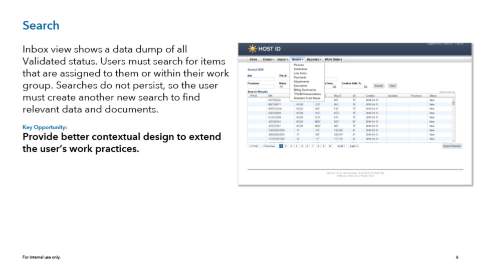
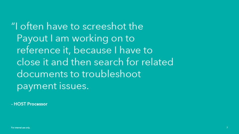
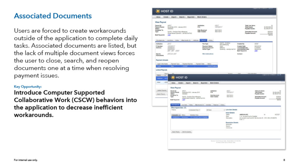
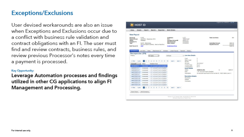
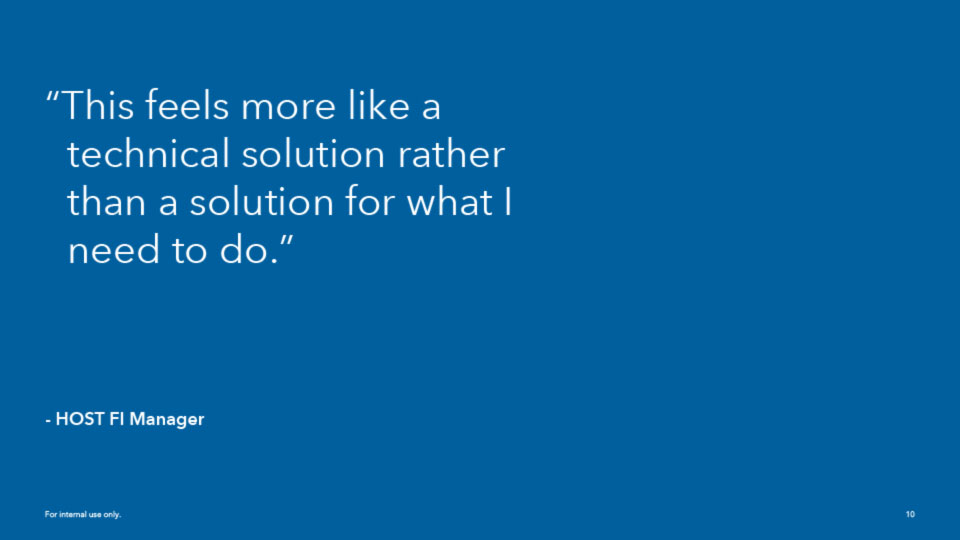
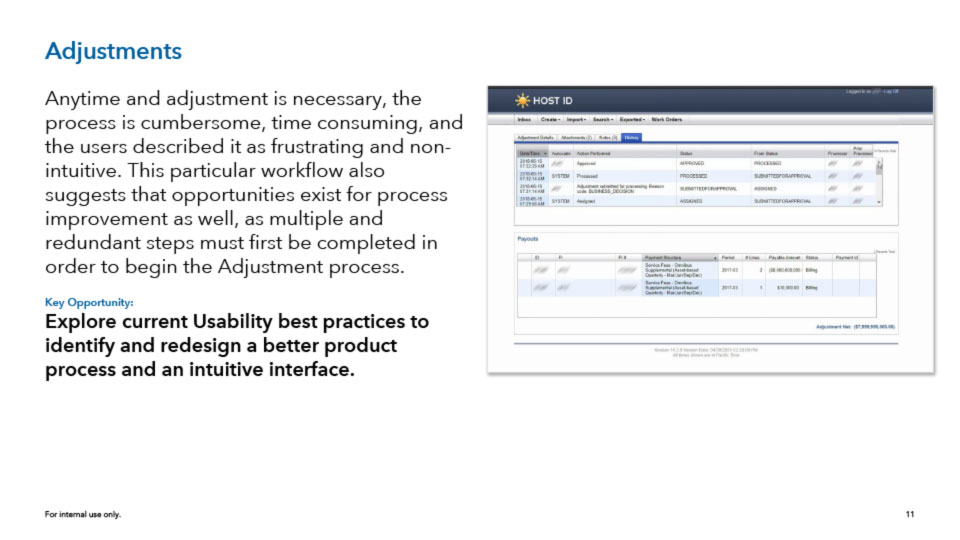
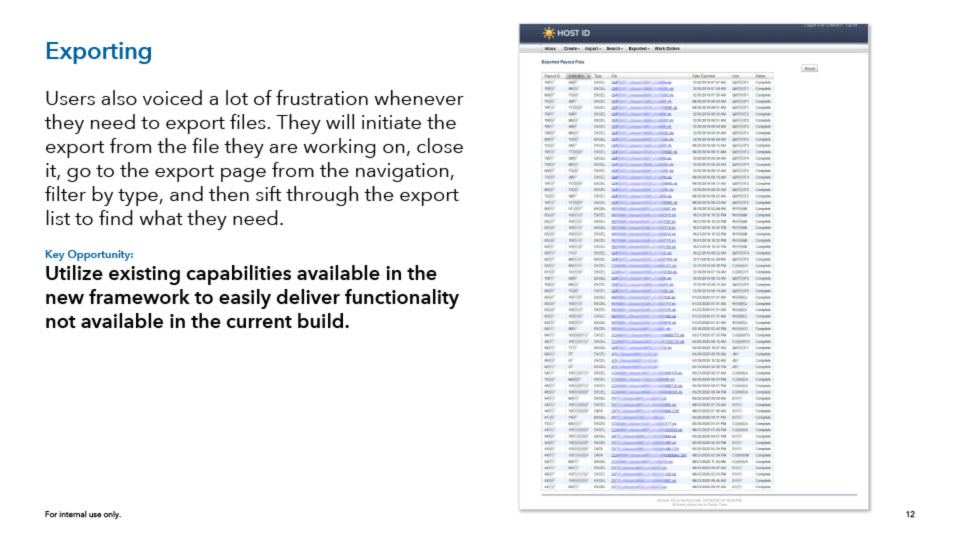
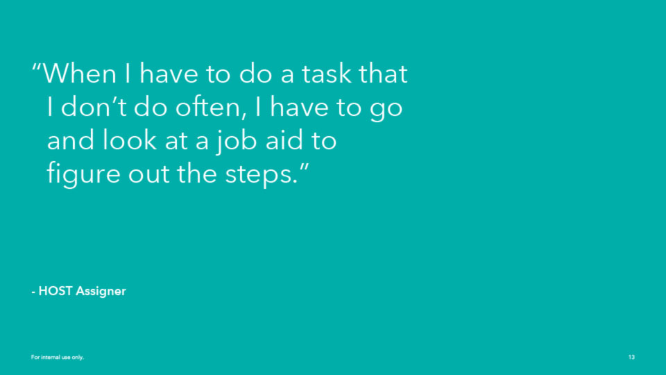
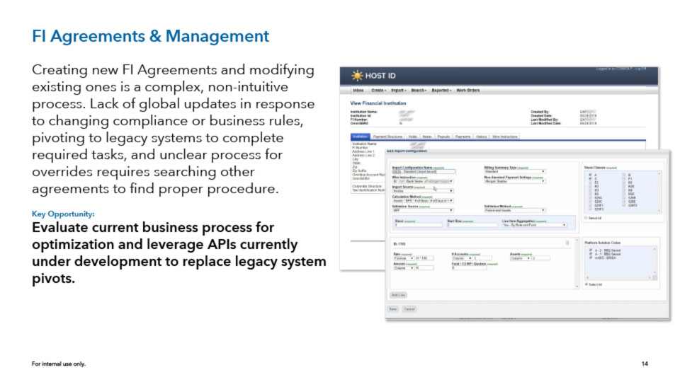
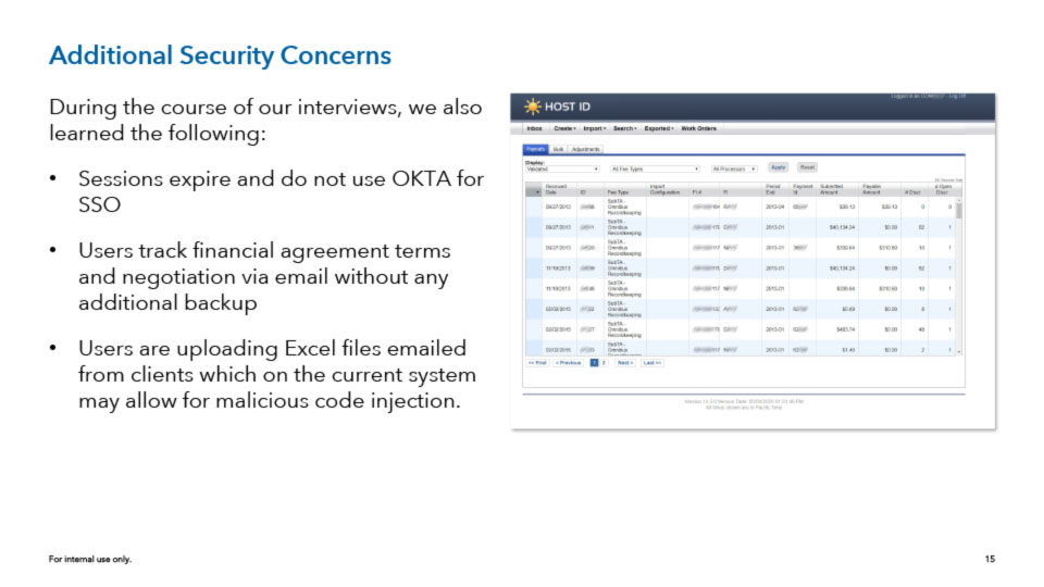
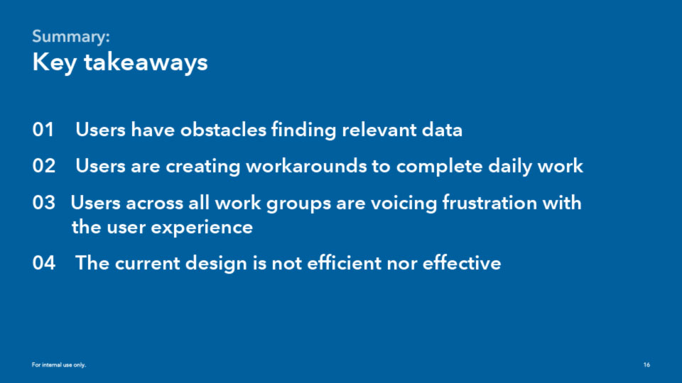
Presentation of findings and high level recommendations after interviewing a cross section of users in a department that handles payment fee processing for Financial Institutions.
As a team member of a larger cross-functional department, I was able to also work with the Change Management team on projects. The Change Management team served as an internal communications department for the changes being made to applications and processes within the company. We worked on a number of efforts to understand the fears the users had in response to changes and automation, and to also educate them on what was being released and when.
Mission patches for the user’s lines of business (above).
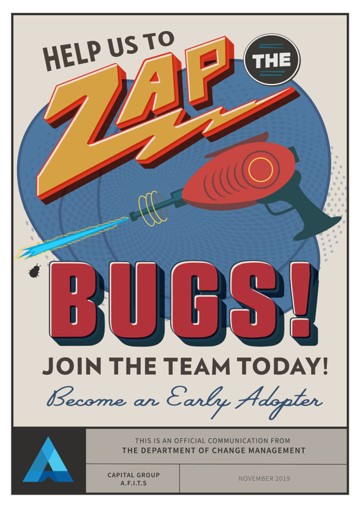
Artwork for presentations to users across LOBs to engage and inform users of upcoming process and application changes (below).
